Out-of-the-Box Template Style Controls
Overview
You can customize template fonts and colors from the Edit Template dialog.
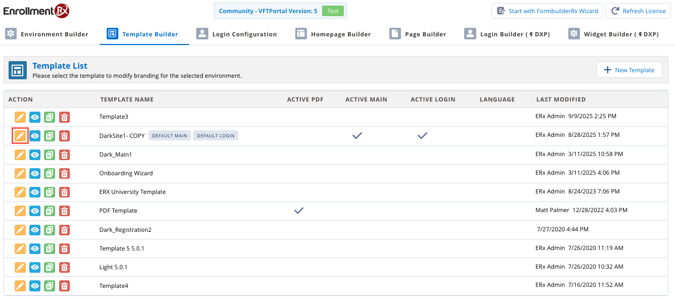
First, click the pencil icon next to the name of your template to launch the Edit
Template dialog.
User interface is related to 2025 Release 1.
When the dialog window opens, scroll down to the Template Style
section:

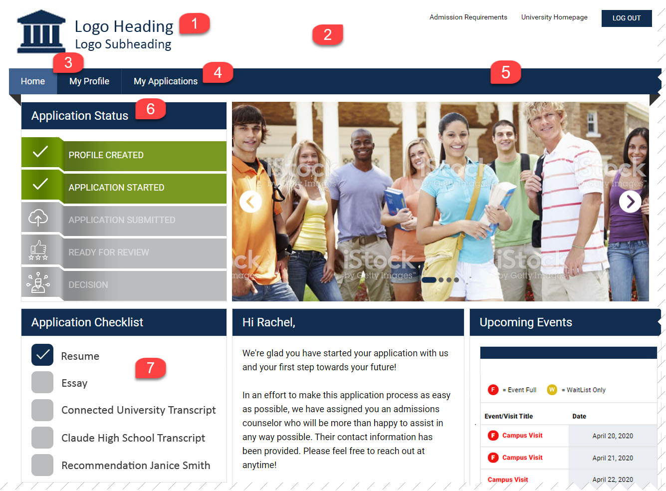
From here you can customize colors and fonts for many different page elements, including widgets, headers, and footers. Refer to the images and reference table below for more detail.
Sample Template Page
Sample Footer

Template Style Reference
| Template Style | What it Does |
|---|---|
| Theme Body Background | Controls background color of page body throughout |
| Theme Font | Controls font in footer, on portal pages (page list, field labels, field inputs) and buttons throughout |
| Theme Content Text Color | Controls text color in Section Headers on portal pages |
| Theme Header Background | Controls header background color (sample template page image, #2) throughout portal |
| Theme Footer Background | Controls footer background color (sample footer image, #9) throughout portal |
| Theme Primary Background Color | Controls tab and footer text bars background color (sample template page image, #5; sample footer image, #8), background of checkbox for received checklist items (sample template page image, #7), text color for items generated via requirement set, background color for page list checkboxes and color of highlighted page name text in page list when on a specific page of portal |
| Theme Secondary Background Color | Controls background color for page list |
| Theme Logo Text Color | Controls logo heading and subheading colors (sample template page image, #1) |
| Theme Primary Text Color | Controls text color in tab bar, footer bar and buttons throughout (sample template page image, #4; sample footer image, #8) |
| Theme Secondary Text Color | Controls footer text color and page list text color |
| Theme Secondary Text Color Highlighted | Controls color of highlighted page name in page list |
| Theme New Hover Background | Controls highlight color of tab when on that page (e.g., Home) (sample template page image, #3) |
| Theme Form Text Color | Controls color for field labels and responses |
| Theme Form Box Background | Controls color of form background for sections/fields |
| Widget Box Background | Controls widget background color |
| Widget Title Background | Controls widget title background color (sample template page image, #6) |
| Widget Title Font | Controls widget title font (sample template page image, #6) |
| Widget Title Color | Controls widget title font color (sample template page image, #6) |
| Widget Checkbox Background | Controls empty checkbox color in checklist widget (sample template page image, #7) |
| Widget Content Font | Controls font of widget content |
| Widget Content Text Color | Controls text color of one-off checklist items (e.g., Education History records) and portal comments *did not change content text color in other widgets |