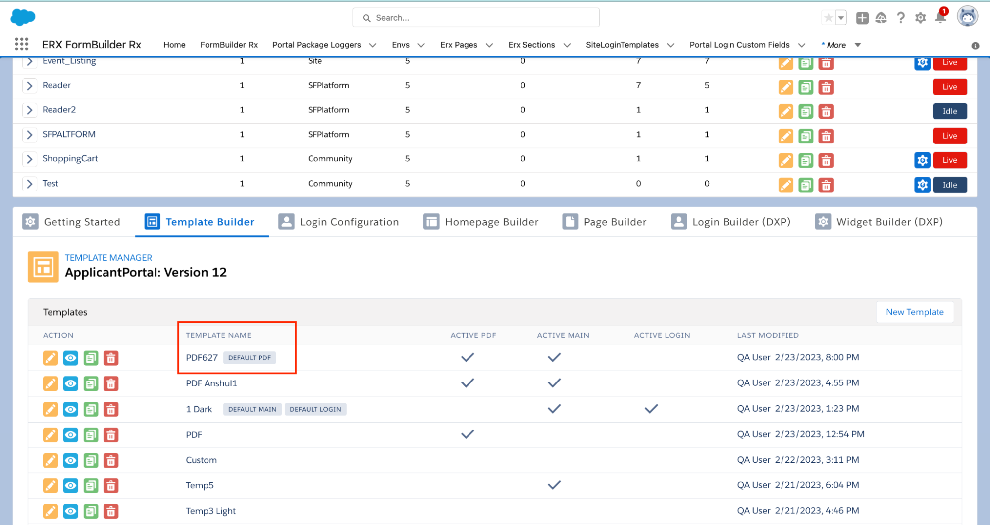
Checklist Widget Library Item
Overview
The Checklist Component is available to be placed in a widget when ERX Core is installed. If Core is installed, then, when you insert the Checklist into a widget, it will behave as follows:
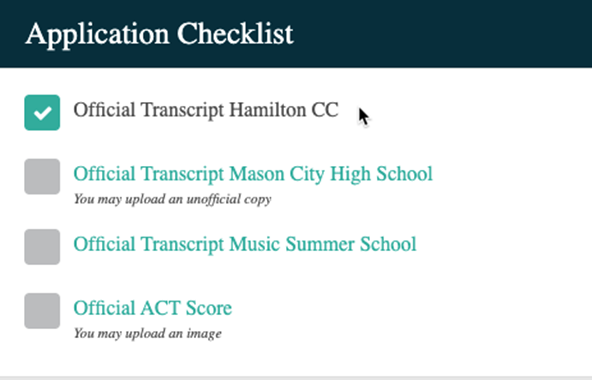
- It displays checklist items. These are the records belonging to Erx Core’s
Requirement Item Objects (“RIO”s). By default, these RIOs are defined in ERX
Core:
- Education History
- Test Score
- Admission Document
- Recommendation
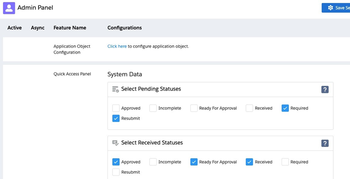
- In order for a particular record to appear in the checklist, it must have a
Status among those selected as “Pending” in the ERX Core Admin Panel:
- The checkbox “Display to Applicant” must also be checked on each RIO record for it to appear in a checklist.

- Multiple Checklists may be defined, because each one can be configured to display different “Categories” of checklist Items. As of ERX Core Summer 2019, RIOs have a multi-select picklist called “Category”. When you add the checklist widget from the library, you see the above screen, where you define which Categories of items to display.
With this feature, you can, for example, categorize RIO records as either “Application” or “Post Admit” and render one checklist that displays both categories while the candidate is applying, and, after the candidate is admitted, render another checklist that displays only the Post Admit category of items. You can have separate checklists for, e.g., Financial Aid requirement items, or Graduate Assistantship application items. You may add any categories you desire to the “Category” picklist.
- Each checklist item record has a field called “Portal Comments”. Text entered
into this field will be displayed immediately beneath the name of the checklist
item
- You can control the style of the “Portal Comments” text by putting the portalComments CSS tag into the header of your template.
<style>
#portalComments{
Color:blue!important;
Font-weight:100;
font-family: 'Orienta', sans-serif;
}
</style>
Example Scenario: Display Two Checklist Widgets on the Same Page
If you would like to display two different Checklist Widgets on the same page (e.g., one to control a Portal User's in-progress items and one to control their completed items), create two separate Category labels in ERX Core. For example, you could configure the Category field to have values of “Application Item Pending” and “Application Item Complete” to define which items will display in which checklist.
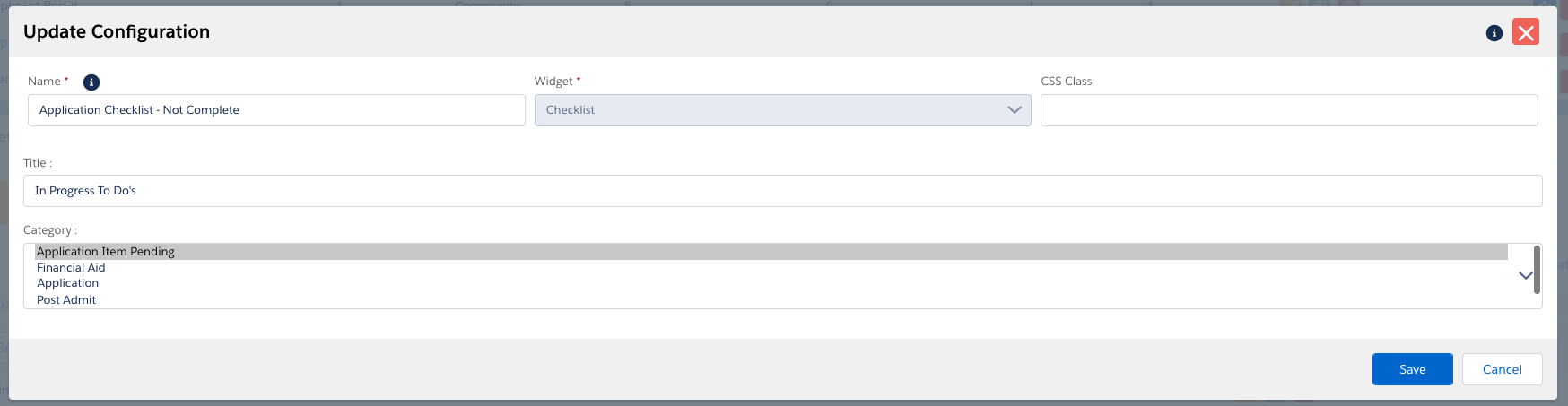
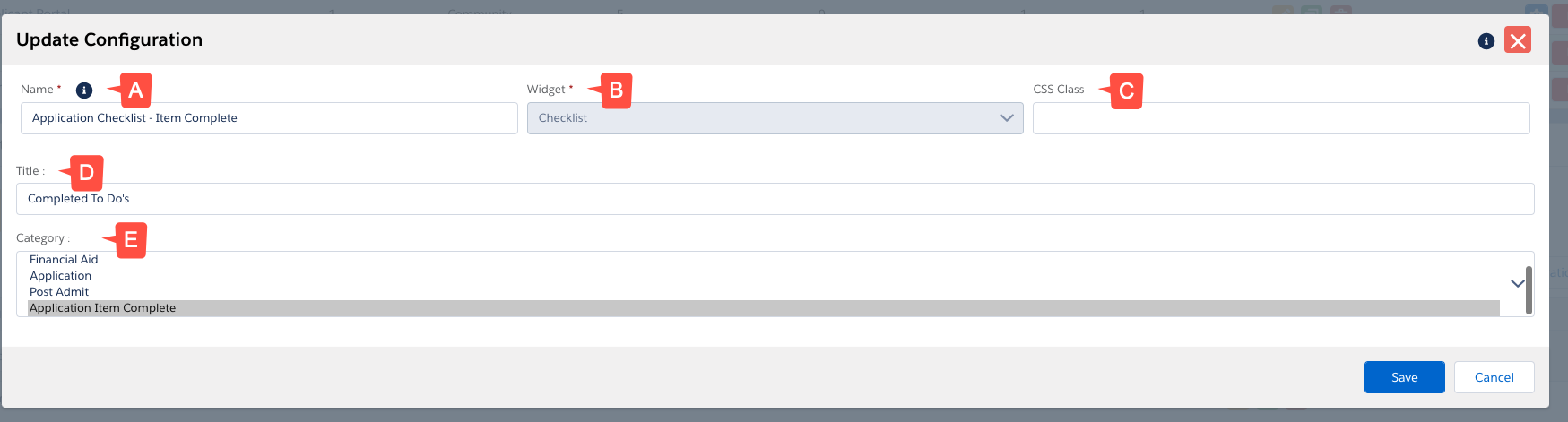
| Label | Description |
|---|---|
| A. Name | Indicates the label on the back end for the checklist widget. Used for internal purposes only. |
| B. Widget | What type of widget is in use from the widget library. |
| C. CSS Class | Can be populated with a custom CSS class to control the look, feel, and overall styling of the widget. |
| D. Title | The front end label a portal user would see when logged in and viewing the widget. |
| E. Category | This is used to define which categories of items to display. See above for an example. |
Clickable Checklist items
Three fields on Checklist Item objects can be leveraged to make a checklist item clickable:
- “Allow Upload” checkbox (
EnrollmentrxRx__Allow_Upload__c) - “Instructive Text” text field
(
EnrollmentrxRx__Instructive_Text__c) - "External URL" text field (
EnrollmentRx_External_URL__c)
Populating these fields will make the checklist item into a hyperlink. When clicked, a window will open that contains a file upload widget (if “Allow Upload” has been checked), instructive text (if “Instructive Text” has been populated), or a link to an external URL (if "External URL" is populated). “Instructive text” can contain hyperlinks, if you wish to direct the user to an external website.
An additional field allows you to suppress the garbage can icon (the delete button) when the user is uploading a document, so that they cannot delete any file they upload:
- “Disable Delete” checkbox
(
EnrollmentrxRx__Disable_Delete__c)
External URL Examples
In 2023 Release 1 we introduced a new field, "External URL," which redirets your end users to an external page when they click a Checklist Item. This field must be configured in ERX Core.
Examples: