Field Configuration
Once Data Sets and Sections have been created, you will be able to add fields to your page.
- Fields are added by clicking and dragging from a data set on the left hand side into a section on the page.
- A numeric value in square brackets next to each field name in the data shows how many times it has been placed on the page.
- You may add a field to the page multiple times, however rendered criteria must be set so that it only appears once at any given time.
- If a field appears more than once, a warning icon will appear next to them when viewing the page in a community.
- An email will also be sent to the “Admin Email” address when a user views a page that has the same field listed multiple times.
- To remove a field from the page, drag and drop it from the layout back into its appropriate data set, or click the X icon near the top right of the field.
The Field Configuration screen is used to configure individual fields from a Data
Set. To open this screen, click and drag a field from a data set on the left side panel
onto the page layout, and then double click on the field label. Below is a sample
configuration screen for the First Name field. The header of this screen shows the field
label followed by the unique API Label in parentheses.
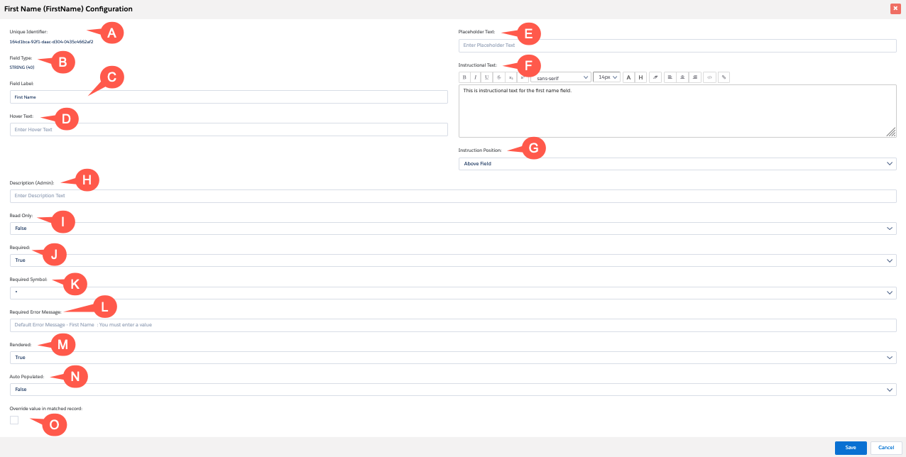
Each field will have multiple configuration options, depending on its type. Not all configuration options are available for all field types. Below are a listing of the basic field configuration options that appear for most fields.
- Unique Identifier: The unique ID of the field.
- Field Type: This non-editable value displays the field type as a reminder to the user.
- Field Label: The label that will appear on the page.
- Hover Text: Text that will appear when a user hovers over a help icon next to the field. The help icon only appears if Hover Text has been entered. The help icon graphic is configured in the Environment settings.
- Placeholder Text: Text that will appear in the field until a user enters a
value. Note:You can apply styling to Placeholder text via CSS in the header of your template. Use this format:
<style> input::placeholder { font-style: italic; } </style> - Instructional Text: Enter text that will appear with the field. You can use
the rich text editor to style the text. Also, there are:
- a “link” button, which allows you to select any words and make them into a hyperlink.
- an “HTML” button, which allows you to insert more complex HTML into the text
- Instruction Position: Set the position of the Instructional Text. This option
only appears if Instructional Text has been entered.
- Above Field: Place the text above the input area of the field
- Above Label: Place the text above the field label
- Below Field: Place the text below the input area of the field
- Below Label: Place the text below the field label
- Description (Admin): For reference by administrators. Explain the role the list component plays on the page for the benefit of your successor admins.
- *Read Only: Set conditions under which the field will not be editable. (Also see Note below.)
- *Required: Set conditions under which the field will be required. (Also see Note below.)
- Required Symbol: This option only appears if Required is set to True or Condition. Choose the symbol that will appear next to this field to indicate that it is required.
- Required Error Message: This option only appears if Required is set to True or Condition. Type your custom message in the field.
- *Rendered: Set conditions under which the field will be visible. (Also see Note below.)
- *Auto Populated: See the Auto Populated page. (Also see Note below.)
- Override value in matched record: See the Override Value in Matched record page.
Start Date/End Date (applies to date fields only, not pictured above)
Set the default date, start date and end date. Also please note the following:
- Dates outside the range between the start and end date will not be available to the end user for selection, and, furthermore, they will not even be visible in the date picker. However, if a date outside the range is already in the database, it will be displayed as usual.
- The “Default Date” is the date that the date picker widget will default to when the user clicks in an empty date field.
- You can set the default, start and end dates to be change dynamically relative to today’s date. For example, you might want a blank birthdate field to default to 18 years ago today whenever a user clicks in a blank birthdate field. You can do this by setting the Default Date to “Dynamic” and then configuring the Date Expression to be “ADDYEAR(TODAY(),-18)” (i.e., add negative 18 years to today’s date).
Note:
*The Read Only, Required, Rendered, and Auto Populated fields
have an option for logical Conditions. See the section on logical conditions for
instructions.